Who Is Greg Lotus
Growing up Greg Lotus grew up in the countryside of West Virginia. He never went to school for photography but he was inspired by the fashion he saw at the place he was living. Greg Lotus became a famous photographers for cover of magazines such as vogue and Vanity Fair. He started to fall in love in photography because he became a model but he always wanted to be thinker behind the picture.
Philosophy Of Greg Lotus
When does his photography his goal is to make people in our society to look at the picture and understand what he is trying to convey to world or the reason why he would choose to add different items in the object. He mostly works with models that are women with different sizes and color so this also creates an idea of society changing the mindset of new generations. He also creates interesting pictures by expressing fashion and how fashion can be shown as art from the vivid language that clothes does to our world.
The Style Of Greg Lotus Photography
Before becoming a famous photographer he started with black and white pictures. However, as he started to get comfortable with photography he started playing with colors. He describes his work like Man Ray and Richard Avedon. His inspiration from his work comes from classical paintings and geometrics forms. As he does his photos he tries to incoporate exotci aninamals to make the pictures look strange and different.
Final Reflections
Overall after completing this project it was really fun to recreate different pictures and try new techniques in photoshop. In my first tri I had graphic design so when I started photoshop it was similar to graphic design because you create a meaning in your pictures. I never thought how a photo can be more than just the objects in it. You have to appreciate the lighting, the shadows, and what they are conveying because now I know how it feels to make a photo the best as you can. You have a voice when you take a picture and knowing that what you are passionate, a quick shot and publishing it can make your voice, creativity, and ideas can be heard.
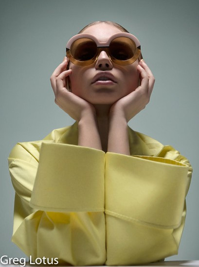
"Fashion" |
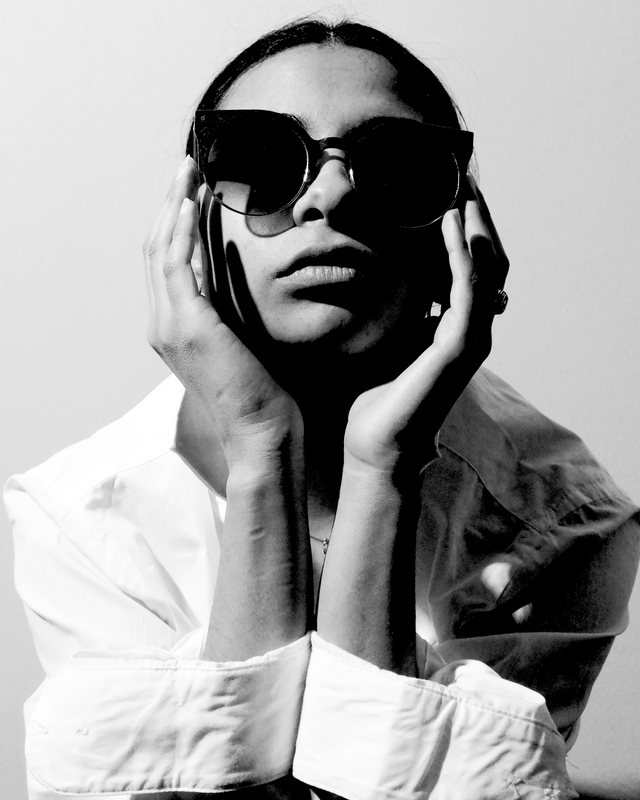
Throwing Shade |
Similarities: In the picture I try to recreate all the items that Greg used for his picture. So, I told my model to wear a shirt that has big sleeves. I also told her to bring the biggest glasses she owns so get the glamorous look. I also told her to slick her back to have her hair like the one Greg Lotus created.
Differences: So in the picture that Greg Lotus created was he used a yellow shirt and as you can see in my picture I used a white shirt. The glasses are not similar but they give the shape that I wanted. Also in his photo is in color and to give it my touch black and white pictures are my favorite to do. Overall I feel like the pose that I told my model to do look very similar and it turned out how I wanted
Differences: So in the picture that Greg Lotus created was he used a yellow shirt and as you can see in my picture I used a white shirt. The glasses are not similar but they give the shape that I wanted. Also in his photo is in color and to give it my touch black and white pictures are my favorite to do. Overall I feel like the pose that I told my model to do look very similar and it turned out how I wanted

"Big Hat" |

Honey It's To Sunny Outside |
Differences: In the picture I took I didn’t have a big hat like the model for Greg has so I just found the biggest one I had. My model didn’t have a slick shirt so I told her to just wear a black shirt. In my model she has her earnings but in the picture that I recreate she doesn’t have earrings.
Similarities: So to create the black table i had a black curtain and i put it flat on a stool and created the effect of the black table. My model she did the same post which conveys what I was trying to imitate. I know that the background isn’t similar but I wanted to had more contrast and less brightness to see a shadow like the model in the “Big Hat” has.
Similarities: So to create the black table i had a black curtain and i put it flat on a stool and created the effect of the black table. My model she did the same post which conveys what I was trying to imitate. I know that the background isn’t similar but I wanted to had more contrast and less brightness to see a shadow like the model in the “Big Hat” has.

"Fashion" |

Can't Think Straight |
Differences: In the picture I took I didn’t have the accessories that Greg used so I had to improvise to symbolize all the bracelets she had on her arm as well as the ring. I also had to improvise with the headpiece that Greg used as well. Also the background the shade is different since you can see a shadow in mine.
Similarities: The pose I told my model to do is pretty similar the the one of the real photo. I like how the brackets are close to what the other picture has and I like the spin I made it by bringing down the exposure.
Similarities: The pose I told my model to do is pretty similar the the one of the real photo. I like how the brackets are close to what the other picture has and I like the spin I made it by bringing down the exposure.

"Vogue" |

Little Party Won't Kill Nobody |
Differences: So a big difference in my picture is that my model is not naked. I also didn’t have a mirror like that so I grabbed a the top of a handle a paint brush to symbolize the mirror. The head piece is different but I created it my buying a headpiece at Michaels and it was shaped as a unicorn so I cut it and glued peacock feathers.
Similarities: I think how I did the letters look very similar especially the color. I also think that even though mine has more exposure overall I added my flare to it so it can express my work but also like how he does his work
Similarities: I think how I did the letters look very similar especially the color. I also think that even though mine has more exposure overall I added my flare to it so it can express my work but also like how he does his work
